The best digital products are not the ones with the most features. They are the ones that are the most intuitive to use. When users can accomplish their goals quickly, confidently, and without friction, they come back. They recommend the product to others. They become loyal customers.
Good UI/UX design is not decoration added at the end of development. It is a structural decision that shapes how a product performs in the real world. This guide covers the fundamental design principles that separate products users love from products users abandon.
Clarity Over Cleverness
The most common UI/UX mistake is prioritising originality over clarity. A unique interface might look impressive in a design presentation but confuse users the moment they try to use it without guidance.
Clarity means every element on the screen communicates its purpose immediately. Buttons look clickable. Labels describe what they do. Navigation reflects the user's mental model of the product, not the developer's internal architecture.
A useful test: show a new user a screen from your product and ask them what they think they can do on it. If they are uncertain or incorrect, the design has a clarity problem - not a user problem.
Reduce Cognitive Load
Every decision a user must make costs them mental effort. Good design minimises the number and complexity of decisions required to complete any task.
Practical ways to reduce cognitive load include:
- Progressive disclosure - show advanced options only when users need them, not upfront
- Sensible defaults - pre-fill fields, pre-select common options, reduce blank-state decisions
- Chunking - group related information together so users process it as a unit, not as individual items
- Consistent patterns - use the same interaction patterns for similar actions throughout the product
When users feel that a product is easy to use, it is usually because the design has absorbed the cognitive work on their behalf.
Hierarchy and Visual Weight
Users do not read screens - they scan them. Visual hierarchy is the design principle that guides where the eye goes first, second, and third on any given screen.
A strong visual hierarchy communicates priority through size, colour, weight, contrast, spacing, and position. The most important action on a page should be visually dominant. Secondary actions should be visually subordinate. Information the user needs only occasionally should be accessible but not prominent.
When hierarchy is weak - when everything appears equally important - users experience the page as noise. They do not know where to start, so they either bounce or take the wrong action.
Consistency Builds Trust
Consistency in UI design is not about making everything look the same. It is about making similar things behave the same way. When users learn one interaction pattern in your product, that knowledge should transfer everywhere that pattern applies.
Consistency operates at multiple levels:
- Visual consistency: Typography, colour, spacing, and component styles follow a design system.
- Interaction consistency: Buttons always behave like buttons. Dropdowns always behave like dropdowns. Destructive actions always require confirmation.
- Language consistency: The same action is always called the same thing. "Save" does not become "Submit" on a different screen.
- Platform consistency: The product respects the conventions of the platform it runs on (iOS, Android, web) so users can apply existing knowledge.
Inconsistency erodes user confidence. Each surprise - a button that behaves differently than expected - is a small friction that accumulates into distrust.
Design for Error Prevention and Recovery
Users make mistakes. Effective UX design anticipates this and does two things: prevents errors where possible, and makes recovery easy when errors happen anyway.
Error prevention includes input validation before submission, confirmation dialogs for irreversible actions, clear constraints on what inputs are valid, and autosave to protect work in progress.
Error recovery includes clear, specific error messages (not generic "something went wrong" messages), actionable guidance on how to fix the issue, and undo functionality wherever it is technically feasible.
The best products make users feel in control even when things go wrong. That sense of control is a significant driver of trust and retention.
Mobile-First and Responsive Design
In most markets, more than half of web traffic comes from mobile devices. A product that is difficult to use on a phone - small touch targets, text that requires pinching to read, layouts that break on smaller screens - is effectively rejecting a large portion of its potential users.
Responsive design is not simply making a desktop layout shrink to fit a phone screen. It is designing interactions and layouts that work well at every screen size - which often means rethinking navigation, information architecture, and interaction patterns for different contexts.
Mobile-first design - starting with the constraints of the smallest screen and expanding - often produces cleaner, more focused interfaces for all screen sizes.
Feedback and Status Communication
Users need to know that their actions have been registered and that the system is responding. This is especially important for:
- Loading states - show progress indicators when processing takes more than a moment
- Form submission - confirm that submission was received and what happens next
- Asynchronous operations - communicate when background tasks complete, succeed, or fail
- Empty states - explain clearly why a list or dashboard is empty and what the user should do
Silence is ambiguous. Users who submit a form and receive no feedback do not know whether it worked. That uncertainty prompts re-submission, abandonment, or support tickets.
Onboarding: The Moment That Defines Retention
First-time user experience is disproportionately important. Users form their impression of a product within minutes of first use. If they cannot find value quickly, they leave - and rarely return.
Effective onboarding is progressive: it introduces features in the context of completing a real task, not through a mandatory tutorial that front-loads information before users have a reason to care about it. The goal is to get users to their "first value moment" - the moment they realise the product does what they needed - as fast as possible.
Design as a Business Function
UI/UX design is not a cosmetic investment. It directly affects the metrics that matter to business: user activation, retention, task completion, conversion rate, and support volume. Companies that treat design as an afterthought consistently underperform those that treat it as a core product function.
The cost of poor design is paid not in the design budget but in churn, in support costs, and in missed revenue from users who tried the product but did not return.
UI/UX Design at Savyasachi Infotech
At Savyasachi Infotech, we design user-centred digital experiences grounded in research, tested with real users, and built to support product growth. Our design process covers user research, wireframing, prototyping, UI design, usability testing, and responsive product design - applied to web applications, mobile apps, and SaaS products.
We work as a design partner, not just a design vendor - bringing strategic thinking to product decisions alongside execution-quality interface design. Get in touch to discuss your product's design challenges.
Design Systems: The Foundation of Scalable UI
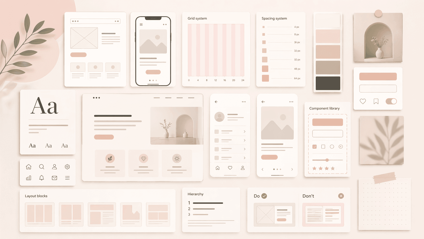
As a product grows, maintaining visual and interaction consistency across an expanding set of screens and features becomes a significant challenge. A design system - a shared library of reusable components, style tokens, and interaction patterns - is the solution. Design systems codify your visual language once and apply it everywhere, reducing inconsistency, speeding up the design process for new features, and ensuring that design and development stay aligned.
Building a design system is an investment that pays compounding returns. Early in a product's life, it may feel like overhead. But as the product scales to dozens of screens and multiple team members, the shared foundation it provides - in Figma for designers, in code component libraries for developers - becomes one of the most important enablers of product quality and development velocity.
Ready to Design a Product Your Users Actually Want to Come Back To?
Great design is not a cost. It is the investment that determines whether your product retains users, converts visitors, and builds word-of-mouth - or bleeds users to a competitor with a better experience.
At Savyasachi Infotech, we design user-centred digital experiences for web applications, mobile apps, and SaaS products. Our design process is grounded in user research, tested with real users, and built to directly support product growth metrics. We work as a design partner - bringing strategic product thinking alongside execution-quality interface design.
Book a free consultation and share your current product or concept. We will identify your highest-impact design opportunities and outline a clear path to a better user experience.